Thanks guys, I really do appreciate the critique.

It is helpful to me to get that sort of feedback and it helps me look at the knife through a "different set of eyes" or two.
Ramrod wrote:I like the contrast in the coloration around the edges. I would not change that part.
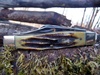
How do you decide which direction to put the etch? Wouldnt it make more sense to be able to read your name when it lays on the backsprings?
Only because you asked!
Mark
That is a valid question Mark.
The reason I etched it that way it that that is when Kershaw etched their bolsters that is the way they did it.
Also notice if you are right handed as most people are, the name is right side up to read when you are cutting toward yourself or when cutting down.
The main reason is; I was following the form Kershaw used for their knives.
Sorry about the glare, it was just a quick pic to illustrate a point.
I share the sentiment many of you expressed about fat stag, some times it works, sometimes it doesn't.
In this case I think it is about 50/50. Functionally I think the fat stag works on the knife.
Ascetically, I think fat stag on this knife is less than optimal.
Practically for me it was easier to build the knife with the thicker handles, though I did thin them about 1/4" as well as tapering them. It was really thick but when I started to remove my finger prints with the belt sander when thinning the stag, I decided that was thin enough!

Thanks everyone for your suggestions!
If you have a new thoughts or comments or someone else wants to weigh in with their opinions, please jump right in!
I think every knife maker can improve, but when you ask people how they like your work they just say nice things. It is nice if you want to build your ego, but it isn't helpful if you are trying to improve as an artist/knife maker, sculptor, writer or in any other field of endeavor that is highly subjective.
I will ponder your suggestions; if I make any changes I will post new pics.
Thanks again!